
Introduction
Product findability in e-commerce and digital marketplaces is critical to user satisfaction and business success. With the growth of online stores with inventories reaching the thousands of items, organizing and navigating through these collections become even more complex. That is where product filters come into play. Product filtering is an integral part of user experience (UX) design that helps users limit enormous sets of results and hone in on what they seek. For example, a shopper using filters can search black dresses in medium size or laptops with specific RAM capacity, whereas, without filters, the risk of being overwhelmed exists.
But creating operational product filters comprises more than just adding some checkboxes in a sidebar; it is about understanding user behavior, appreciating information architecture, and precision in interaction design. Filters in poorly designed systems can confuse, distract, or even annoy users into totally abandoning the site. And like well-designed filter UX will increase discoverability, speed decision-making, and improve overall user engagement-and that means conversions. In this beginner’s guide, you’ll learn the basics of a product filter UX design (layouts, logic, user psychology, and performance optimization) to let you create user journeys that are smooth and satisfying.
Understanding the Role of Filters in UX Design
Helping Users Make Confident and Efficient Decisions
Product filter UX design is mainly about empowering users to make prompt and confident decisions. By the time a user enters an e-commerce platform, there is a tonal intent about what they want to buy. It could be shoes in a certain size, electronics under a given price, or furniture to match a specific color scheme. Minus filters, these users would endlessly filter through irrelevant items, multiplying their frustration levels and chances of leaving the site altogether. With well-structured filters, designers send users toward relevant options to reduce cognitive overload and streamline the purchasing path.
Truly, a seamless experience enhances the outlook of a brand. Users are bound to trust a platform when the website seems to understand their needs and presents a convenient method to fulfill those needs. Users will be more inclined to return for future purchases or recommend the website. From a UX viewpoint, filter options reduce distractions and establish a linear path in the user journey. The users are led to a more enjoyable, efficient, and goal-directed experience rather than stumbling upon multiple pages or scrolling forever, refining the product lists in real bank time through apparently defined attributes.
Supporting Both Goal-Oriented and Exploratory Users
Another factor that usually is neglected in UX filters is user intent. Every visitor to an online store has a different browsing behavior. While some users are highly goal-oriented, knowing exactly what they would be looking for, others might browse only for inspiration or exploring their options; these are called exploratory users. A well-designed filtering solution would equally cater for both types of users. Goal-oriented users can use filters to reach their desired items, brand specifications, or any custom-defined specifications such as price, size, or rating, to narrow the product list right away.
Explorers do not consider filters as an end; they are more like guideposts along a path. They differentially start broad and refine over time based on what captures their eye. Examples include “best-selling”, “new arrivals”, and “often bought together”-filters that still offer avenues for exploration. These users even have substantially different journeys in filtering, where possible options would change depending on given choices and availability. Thus, enabling such fluidity in adaptive filtering and live update would be essential in drawing exploratory users. Another hallmark of thoughtful design in the user experience is an understanding of user intentions in terms of variety: filters that can accommodate both discovery and specificity.
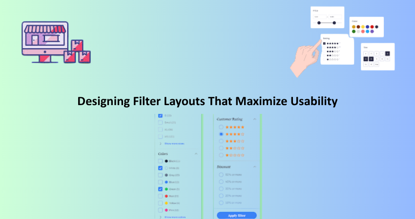
Designing Filter Layouts That Maximize Usability
Choosing the Right Placement and Format
The different filter layout choices substantially affect usability and engagement. Filters are most commonly found embedded into a side bar at the left hand-side of a product listing page. This is in keeping with the user’s expectations and all reading patterns at least in cultures that read from the left side to the right. However, direct modifications will primarily depend on the nature of the products offered and how end-users interact with the site; maybe top horizontal filters or collapsible drawers would be better suited. For fashion websites, horizontal filters would suffice in conserving space for the mobile usability point. Enhanced methodology for placement can always be tied directly to what renders a seamless possible experience for such audiences.
Besides placement, the format of filters—checkboxes, sliders, dropdowns, buttons—is equally important. Every type of control has its advantages and disadvantages. Checkboxes occur mostly in areas where multiple selections are required, like sizes or colors, and sliders lend themselves to continuous ranges, such as price or weight. They help economize on space while hiding some of the options. This reduces discoverability. However, the more sites are consistent with their filter design, the easier it will be for users to learn and interact without confusion. Testing different shapes and taking user feedback can lead designers to the best, most intuitive layout that promotes interaction without overwhelming the page.
Grouping and Labeling Filters for Clarity
The grouping and labeling of the filters are as important as their display. They should be arranged logically, usually according to categories that users would naturally think in—like, size, brand, price, color, or material. Grouping similar filters minimizes cognitive load and enhances users’ ability to work through options quickly. For instance, “Material” and “Fabric Type” have to be mentioned under one heading or at least next to each to clear some confusion. On the other hand, filtering groups should be minimized by reducing the number of default groups while letting the user expand for others, thus keeping it neat and digestible.
Implementing a clear and consistent labeling system is fundamental for usability. Usable terms should be provided, avoiding technical terms or those used in the branding that might create confusion for the user. A filter called Battery Life is easier to use than Lithium Duration. Showing the number of results for each filter option (e.g. Black (122)) gives context to the users, informing their decisions even more. Well-labeled filters increase interface intuitiveness and enhance users’ confidence in their selections, thus improving the overall shopping experience.
Creating Effective Filtering Logic and Functionality
Supporting Multi-Select and Logical Operations
Good filter UX design does not simply stop at layout and labels, but goes further into function behind the scenes. One of the most important of these would include the multi selection capability, in which users can choose one or more option in a given category. For example, this kind of filter may be a big plus for a shopper who may want to view both “blue” and “green” shirts simultaneously. Unfortunately, such options in which only a single value can be selected from a category become so limited and frustrating. Multi-Select Filters: This filter encourages flexibility because people often tend to display behavior closer to an act of real-world shopping, such that they may have many things to consider before they actually file their choice.
Equally critical is the manner in which the filtering logic handles multiple selections across the categories. For example, if a user selects “Nike” under brands and “Red” under colors, the user expects only red Nike products. This means the filtering system should be able to carry out AND operations effectively. Whereas in a category by itself, meanings would prove an OR function for users, as in showing red and blue items if both were selected. The filtering system should be intelligent enough to interpret those logical conditions and apply them in a way consistent with user expectations. Failure would lead to confused product lists in addition to irrelevant things that drive users away.
Providing Real-Time Updates and Feedback
Now-a-days users expect promptness and quickness. In a modern filter experience, changes in products should take place in the case of adding or removing filters, without the need of refreshing the page. This dynamic approach keeps the experience engaging and smooth. Immediate changes when selections are made allow users to feel like they are more in control of the interface. Delays and unnecessary reloads break the flow and introduce friction especially on mobile devices. Immediate feedback makes it clear to the user what happened when a selection was made, and then encourages more tries.
To enhance this experience of being live and real-time, it is always possible to add more visual feedback elements such as loading spinners, animations, highlighted filters, etc. All these give users an idea that the system has received their feedback and is doing something. Showing active filters either at the top of the product list or the sticky filter ensures that all users can check them at any given time to revise or clear them. In addition, undo functionality or a “Clear All” option should be provided. These examples are small yet powerful design decisions that make filtering easier for the user while also creating a sense of interactivity and control along the entire user journey.
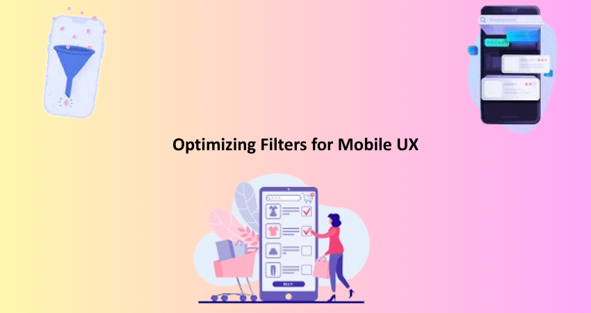
Optimizing Filters for Mobile UX
Adapting Design for Smaller Screens
With optimizing filters for smaller screens now a must, it has become increasingly used to undertake shopping on mobile devices. Mobile UX has at its disposal unique challenges in context of small screens, slow internet connectivity, and distinctive user interacting behavior on mobile devices. Filters in the mobile version can generally be found in a collapsible drawer or modal that covers the screen. In this way, the product list remains prominent while maximizing the usable space. An important feature of mobile sites is that the “Filters” button should be made visible consistently located to access it easily, mostly at the top or bottom of the mobile screen.
Touch-friendliness is synonymous with mobile filters, so it is preferred to have large tap targets and separated options to avoid any misclicks. Next in line are the user perceptions regarding deep nesting and excessive scrolling within filter menus. Collapsible sections within the filter drawer can ease usability when large sets of filters are present. For those who are mobile, it has a been optimized interface in swiping, tapping, and pinching, which is exactly how many mobile users prefer skimming through content and needing rapid gestures. Perfectly designed and responsive filter menus significantly dictate the high pace of navigation, enhancing the overall mobile shopping experience and lessening the bounce rate.
Ensuring Performance and Speed on All Devices
Good mobile UX is largely dependent on performance, especially when it comes to filtering capabilities. Slow filters or unresponsive controls frustrate users and drive them away from the site. Filters must load quickly and work smoothly even on slower connections in less-powerful devices. Seamless filtering without lagging requires developers and designers to optimize for backend logic and front-end rendering. This includes creating a very responsive UI with techniques like client-side rendering, lazy loading, and caching mechanisms that do take a performance hit in the opposite direction.
Perceived performance is equally important. Allowing users to see a small loading indicator while the filters actually do their work makes the UI feel responsive even if there is a delay of a few milliseconds. Lightweight design, compressed assets, and fewer depending heavy scripts sway in speeding up the loading time. Lean filter logic should maintain the ability to browse through heavy product catalogs comfortably. Performance enhancement can thus be marked not merely as a technical enhancement; it is part of UX design which interfaces folks’ perceptions into the experience and turns it into a decisive factor on whether they proceed or abandon the journey.
Conclusion
Product filters are foundational to a positive e-commerce user experience because they help shoppers quickly navigate through large inventories, find relevant products, and feel empowered to decide. A well-designed filter can enhance usability, support divergent user behaviors, and prove extremely profitable concerning conversion rates. Filters, if not well designed, create hurdles that allow frustration from users resulting in poor sales and negative associations for the brand.
The beginner’s guide has outlined the core features of good filter UX design, such as understanding user intent, creating logical paths of interaction, and mobile optimization. Every single detail, from filter placement and labels to instant updates and fast performance, is equally critical for an effortless shopping experience. Concern about the smart filtering system will grow as the level of competition in the e-commerce sector heightens. The filtering systems should be both functional and fun to use. A good filtering experience helps the user find what he is looking for, builds trust, encourages repeat visits, and compliments the brand experience as a whole.