Understanding Google’s Mobile-First Approach
One should know the mobile-first indexing technique when he speaks of the handling of mobile sites by Google. The main point is that Google has brought mobile versions of your site to be used primarily for indexing and ranking. It is no longer about how such pages would appear without a mobile device using them; in other words, desktop versions. It is because mobile traffic has been proven to increase over the years. Therefore, Google had to change policies to ensure the best experience for any user, irrespective of whether he uses a mobile device or a desktop computer.
This is important because if the mobile part of your site does not excel compared to its desktop version in terms of content quality, structure, and usability, your rankings will drop. This is why achieving the mobile configuration is no longer an option; it’s a must. That’s how much time Google wants to give people everything they want and as quickly as possible on the devices they use the most.
The good news is that Google is loud and clear about its preferred method: responsive web design. It’s the most efficient use of servers while not needing your users to switch between different versions of your site. It’s also simpler for search engines to understand and crawl.
However, if you were looking for sustainable SEO benefit and exceptional user experience, compliance does not only make responsive design a recommendation but also the highest standard. We will discuss this in more detail in the following sections about what makes responsive design so valuable and how it stacks up against the competition and how to implement it.
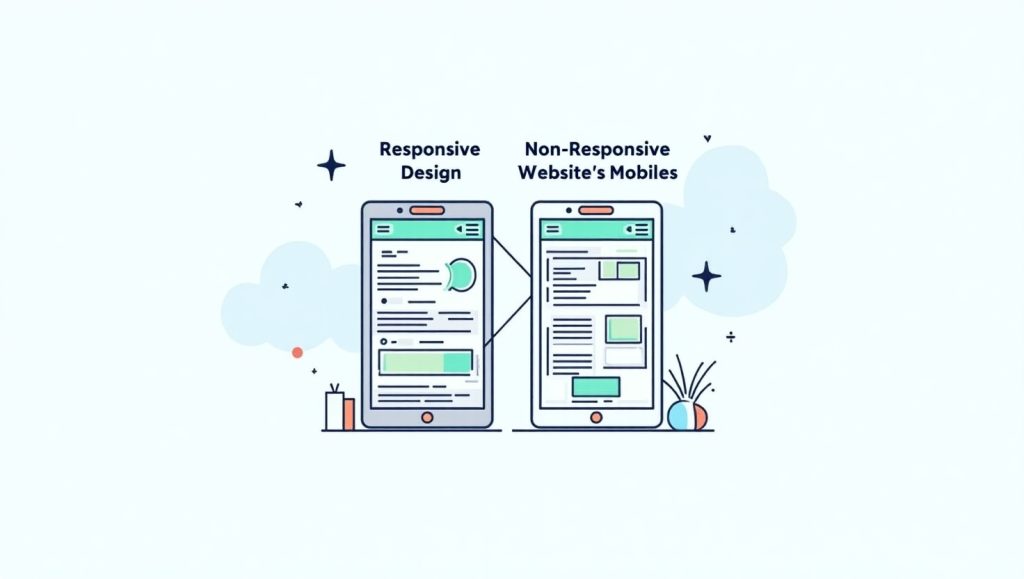
Responsive Web Design: Google’s Number One Choice
Responsive Web Design (RWD) is Google’s top recommendation, and rightly so! Responsive design means using one site to provide different layouts, images, and content for different screen sizes-from the small screens of smartphones to giant desktop monitors. This is a big win for usability, and it also creates an easy content management system since there are no alternate versions of the site that need maintenance.
You could picture it as a smart assistant to your website layout-it senses the environment and accommodates accordingly. Whether it’s a large monitor or a small mobile screen, responsive design will always ensure that a visitor sees the same content without unnecessary scrolling or zooming through.
One of the greatest advantages? SEO management becomes really, really easy. Since there is only one URL for each page-with other methods such as dynamic serving or separate URLs-you could encounter the dreaded duplicate content issue, inconsistent metadata, or split link equity. Search engines like clarity, and RWD gives it to them by the truckload.
The other upside is ease of analytics tracking. This way, you won’t have to track multiple versions of a site. Doing this with one code base helps reduce maintenance costs over the long run.
In conclusion, responsive design is well suited to what users want-fast, smooth, and easy experiences-which is what Google rewards. So in terms of going forward with a new project or looking for a redesign, going responsive is the way to go-smart and future-proof.
Why Responsive Design Beats Other Mobile Configurations
Surely there will be questions about alternatives? Ideally, dynamic serving and separate URLs should be permitted by Google. The downside is that it’s a real pain to implement and even more so to maintain, with mistakes being highly probable.
Dynamic Serving means that depending on which kind of device the user is using to browse, the web server will detect the device and send separate HTML versions according to screen sizes that are considered adequately for that device. It sounds like a nice idea. Still, in actual execution, it gives rise to many configuration issues normally resulting in slow performance in loading content or errors altogether in loading the right content-red flags when it comes to SEO or user experience, alike.
Separate URLs were once popular since they wanted things like “m.example.com,” which offered the mobile version. Now, this is a failure and not worth it. You end up managing two sets of content, two sets of metadata, and consistently update them. That creates confusion about whom to share their link. If a mobile user sends this link to a desktop user, this guy shows content that may render incorrectly.
Google tends to say it like they mean it: All of the three options are generally supported, but responsive web design being the most efficacious of all makes it least prone to errors. It enables faster load time-a ranking factor-inherently, does away with complex redirects, reduces chances for an SEO blunder that may pit them against their own interests, and guarantees users the best experience there might be on any device.
Best Practices for Implementing Responsive Design

To start with, we need to set grids and layouts that are flexible. Minimizing the use of fixed measurements in your CSS and maximizing the use of percentage or relative units such as em and rem is an important step. It lets your content fluidly scale across various devices. Breakpoints hold significance in the CSS units of measurement for the layout change so as to better grow with the size of the screen.
Optimization of images and media would be the next thing. Large, unoptimized images can dramatically kill load times on the mobile side. Use responsive image techniques, such as the use of the srcset attribute, in order to serve the correct image size to the user depending upon their screen. Other useful things to use include WebP formats and lazy load.
The typography is another important aspect. Ensure that your text will look readable on small screens. Use clean and readable fonts, while also making your line length and spacing comfortable.
Test, test, and test. Google Mobile-Friendly Test will reveal how your pages rank. It points out the problems in detail, such as whether clickable elements are too close to one another, or if text is too small. Be sure to test regularly on a variety of devices, so you’ll catch issues before your users will.
Practicing these ensures not only that you have a responsive site; it sets a firm base for long-ranging SEO success as well as user contentment.
Common Responsive Design Mistakes to Avoid
Responsive design does seem to be the most preferred path, but that really doesn’t matter all that much when a developer is pushing his or her poorly redesigned content around. We’ll discuss some mistakes that could drag their performance down or land negative consequences on their rankings.
Hiding content is the most significant reason for mobile traps. Some designers like the look of the slim mobile versions, thinking they’re cleaner. Using mobile designs to hide keywords or even critical information is considered a terrible idea by Goggle. Aim in getting the whole experience for all devices.
Unoptimized images. We talked about it above again, but make no mistakes—it comes up again. Marrying a 2MB image to a mobile is not only an expensive solution but also a poor UX practice. Optimize the URLs according to good practices.
The touch elements make the users tap and scratch again. The buttons and the links need proper dimensions to permit at least some screen space. Once in a while, users tap the wrong link by accident, leading to bounces where they are sent off too easily. Remember, bounces do not help in having a site rank better.
Additionally, one of the bad decisions comes from not testing on actual devices. An emulator is a good starting point, no doubt, but nothing can substitute for real testing experiences on the phone or tablets. Some device-specific usability bugs or even some layout bugs can easily crop up in such a situation.