
Introduction
Over the last few years, web accessibility has changed from a best practice to one that is now being legally enforced. The internet is a vital part of services, education, information, and commerce, yet millions of people with disabilities could face barriers in trying to access anything online. This is when a strong web accessibility checklist comes in handy. If you make your site accessible, you do not just comply with WCAG 2.2 and the ADA; you also expand your audience, optimize for search engines, and enhance the user experience for everyone.
This exhaustive web accessibility checklist of 2025 is exclusively created enabling its users to develop all inclusive digital experiences that consider a variety of usages concerning different needs such as visual, auditory, cognitive, motor, and neurological disabilities. It offers practical ways across major headings: semantic HTML, keyboard navigation, color contrast, alt text, interactive components, multimedia accessibility, ARIA roles, and responsive design. Each of these guidelines ensures that your website is usable by people of all abilities and conforms to modern accessibility standards.
Semantic Structure and Headings
Using Proper HTML Elements for Meaning and Order
From this idea, semantic HTML emerges as the bedrock of web-based access. Elements like , , , , and are structurally meaningful for assistive technologies, such as screen readers or other tools, in organizing the contents of all pages. This structure not only makes things easier to find on search engines but also keeps the content easier to maintain. Using some non-semantic tags, for example, or instead of other elements, usually leads to confusion among those users who depend on assistive technology and those developers who have to maintain the code.
More emphasis will be laid on semantic structure by accessibility audits in 2025. It helps make a particular meaning and purpose make sense for every single element on that page, which is not entirely a matter of rule compliance; it directly helps efficiency. For instance, headings should be in a sound hierarchical order, that is, between <h1> and <h6>, guiding users through which contents would be looked into and how they would be traveling through the flow. When a proper structure is followed by the contents of a page, they can easily be scanned by a screen reader and laid down for accessible dynamic content by using ARIA and JavaScript. Without this backbone, most high-level accessibility enhancement often fails to prove worth.
Ensuring Logical Heading Hierarchies
Properly nested headings are essential for accessibility. Each page should open with one <h1>, which usually represents the subject of highest importance. Subsequent headings are <h2>, followed by <h3>, and so on. Skipped heading levels or improper order brings confusion to screen readers and jumbles the navigation experience for the intervened users. This structure will also provide some SEO advantages in helping search engines understand the relationships among content.
Tools, such as browser extensions, accessibility plugins, and browser developer tools, now include heading structure visualization to help developers check whether the page hierarchy makes sense. In 2025, services such as Lighthouse and Axe will automatically flag violations in the heading structure. The developer’s duty will be to ensure that headings are not visually styled to appear to be in a different hierarchy from that suggested by their semantic tag. When there is consistency in visual hierarchy and semantic structure, it becomes a very pleasant experience for all users, including those using assistive technology.
Keyboard Accessibility
Ensuring Full Functionality Without a Mouse
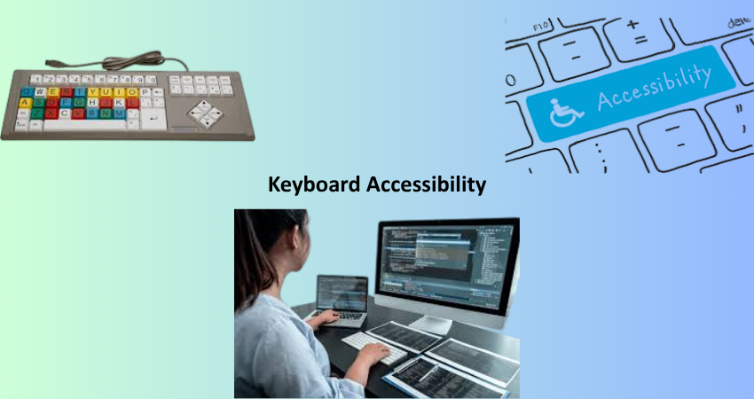
Keyboard navigation is an absolute way for many users with motor impairments, repetitive strain injuries, or types of limitations that are either temporary or situational. Menus, links, forms, buttons—basically any interactive component are to be fully accessible without the aid of a mouse. Components that are not accessible and can only be acted on by click or hover act as barriers to these users. For that reason, developers will need to evaluate keyboard-only interactions thoroughly to meet the accessibility requirement in 2025.
Typical tests include tabbing order, focus visibility, and state change upon interaction. All controls have to be assessable and activated using keys such as Tab, Enter, Spacebar, and Arrow keys. Important elements should make their focus states visible through outlines or highlights so that the user can easily tell where he/she is in the interface. Thus full adherence to keyboard support not only complies with existing WCAG guidelines but also greatly enhances the workflow of power users and developers who depend on keyboard shortcuts to perform tasks and improve productivity.
Avoiding Keyboard Traps and Managing Focus
Keyboard traps have access challenges for most users, as it allows them no alternative way to get away from an element other than by using their keyboard. Such traps are mostly found in modal dialogs, embedded widgets, or custom components. Focus management works correctly, allowing users to access these components easily, and likewise, exit them without interfering with a consistent and navigable user experience. JavaScript focuses the modal only for as long as it is necessary and gives the users a clear way to close the modal or go back to the main content.
As such, the best practice in 2025 is to use programmatic focus() and blur(), as stipulated in the ARIA attributes of aria-hidden, aria-modal and aria-labelledby, as a way of ensuring clearness in focus management. Focus outlines should never be turned off purely for visual reasons but can be modified for brand consistency without depriving accessibility. Keyboard traps often exist in SPAs(single page applications); hence it is important to test all dynamic content updates for keyboard operability and behavior regarding focus.
Visual Accessibility and Color Contrast
Meeting Minimum Contrast Ratios
It emphasizes the need to ensure that our users whether visually impaired, color blind or having low vision can read and understand content. Under the new WCAG 2.2, the minimum contrast ratio downward is 4.5:1 for normal text, and 3:1 for large texts. At least in 2025, dark mode and user-selectable themes made it also more relevant.
New-age design systems must have built-in tools for contrast checking and create accessible color palettes as part of brand guidelines. It is not just restricted to testing the contrast of text, all other UI components like buttons, input borders, icons, and so on come under testing purposes as well. Nowadays, there are unprecedented numbers of automated tools that either integrate perfectly with design platforms such as Figma or code environments such as VS Code to validate contrast levels in real-time. Accessibility design doesn’t mean putting off aesthetics; it means that your design has to be inclusive to all users.
Avoiding Reliance on Color Alone
Like depicting errors by the use of red color or point out the active tab by green color-the same solely solely rely upon colored information: excluding the ones whose perception of color might be less than accurate. Color can only be one of the indicators; other indicators might have to be used in combination, such as text labels, icons, or patterns, to recognize an annotated condition. An error message does not just flash a red border upon an input box; it can also show a warning icon or have explanatory text.
By the year 2025, the combination of color, text, and iconography would be cited as being the only method of accessible form validation. These include WAI-ARIA and ARIA Live Regions, among other tools to give this type of feedback to users of screen readers. It is up to designers and developers to work hand in hand to ensure that visual cues are clear in multiple formats. Using color alone is not just bad practice for accessibility, but also increases cognitive load on users unfamiliar with the interface or experiencing it in poor light.
Accessible Forms and Inputs
Properly Labeling Input Fields
Forms are a dominant aspect of a huge number of websites, particularly in e-commerce and customer interaction processes. All input fields must have a label to attach its purpose to it in an accessible fashion. This can be done either via the use of <label> elements attached to the input fields, or aria-label attributes, or for more complex interdependent relationships, via aria-labelledby attributes. The suggested solution is that placeholder text can never be used by itself to label an input field, for it disappears when users start typing and can confuse a user with a cognitive disability.
The use of correct markup allows screen readers to announce form elements correctly so that it is understandable and predictable. For instance, any radio button group must share the same fieldset and legend so as to convey to a user that the options are related. The developer should also make sure there is sufficient spacing maintained in a logical tabbing order and that focus styles are evidently discernible. The accessibility of forms and the develop-ment of a stress-free, friendly environment for all users having disabilities are some positive steps toward creating a great experience for all users.
Providing Descriptive Error Messages
Error messages must be clear, practical, and easily found. “Invalid input” does not help a user understand or rectify the issue. Messages such as “Your password must contain at least eight characters, one uppercase letter, and one number” show users the way. The messages should relate through aria-describedby to their associated input programmatically or should programmatically place the error in each field’s reference container.
Accessibility can be improved with live validation, focus redirection, and summaries of errors. During an error case, focus must be put on the error message or the first erroneous field so assistive technology can announce that an error occurred. In 2025, real-time validation for forms assists a user and relieves frustration as he performs the task. However, error messages should be more than damage control; they must include gentle reassurance and instant clarity along the user’s journey.
Multimedia and Dynamic Content
Captioning and Transcripts for Audio/Video
Every multimedia content must include captioning, transcription, and audio descriptions to enable access to hearing or cognitive impaired persons. Closed captions are time-synchronized and true-to-sound, while transcripts are complete with speaker identification and description of where the speaker is located. The automated captioning service improved further in 2025, but it is still requisite for manual human review for accuracy.
All video players must be created to allow keyboard navigation, have screen reader compatibility, and visual controls. Audio-only materials such as podcasts also need to be accompanied by transcripts of the material included. These are applicable to users with disabilities, but also to the SEO benefits of increased reach and comprehension for non-native speakers and, of course, those without disabilities. Accessibility of multimedia is not just about compliance; it’s about storytelling for all.
Handling Live Content and Notifications
It should also be readable through a screen reader without any disturbance to a user interaction experience such as alerts, chat messages, or live notifications. Live regions in ARIA (aria-live) are important to make the announcements automatically for changes. The developers should also ensure that such alerts are meaningful, relevant, and interrupting the main task only when necessary.
Dynamic contents in modern web applications must always be properly structured and semantically labelled. Modal dialogues, carousels and expandable panels should manage focus properly and offer an obvious exit. As web applications become more complex in 2025, dynamic content management becomes an important keystone of any accessibility strategy. Testing with real assistive technology and a variety of user personas is essential for understanding usability across all contexts.
Conclusion
It is modern web development in 2025-the general condition of web accessibility cannot be viewed as something to be done secondarily but should instead be considered as a base. This checklist is probably a very thorough reference list for creating inclusive experiences that comply with global standards but are extremely usable for all users– irrespective of how capable or otherwise the users are. Each level of your site-from semantic HTML and keyboard navigation to multimedia and dynamic features-should be purposely designed with accessibility in mind.
By following these best practices, both developers and enterprises will demonstrate their commitment to inclusion, equity and digital responsibility. Improved SEO, better reputation brand, lower legal risks, and broader audience will be obtained as a result of these changes. Most importantly, it aligns your digital presence with the values of openness and empathy. Innovate as we may along the limitation of the web, taking every step in developing accessibilities should always be at the core of every decision because no user is ever left out.