
Introduction
Web accessibility is the plan that makes digital products accessible for persons with a wide spectrum of abilities and disabilities. Too often, the discussion is around compliance with WCAG guidelines; adding alt text, supporting screen readers, etc. While all these points are important, it must also be noted that accessibility is primarily about usability. The more usable a website is for all users, including those with disabilities, the more accessible it is. Therefore, usability and accessibility are simply two different perspectives on the same underlying principles. Unless these two considerations are tackled in tandem, truly inclusive design cannot be achieved.
Usability principles form a strong basis for accessible experiences. They are clarity, consistency, error prevention, flexibility, and feedback. In addition to helping users without disabilities move easily through websites, they help users with cognitive, motor, visual, and hearing challenges meaningfully engage with the digital environment. This article will analyze crucial usability principles that coincidentally reinforce web accessibility goals. We will then proceed to discuss how, by applying these principles, interfaces can become intuitive, inclusive, and effective for all users.
Principle 1: Clarity Enhances Perception and Understanding
Clear Content and Labeling
Clarity is the key to usability and accessibility. Users should be able to quickly tell what a webpage is about, what can be done on it, and how a task can be accomplished. Unclear labels and ambiguous content can baffle and frustrate users with certain cognitive impairments or learning disabilities. For everyone, the clearer the text is, the better the understanding. Headings should accurately summarize the section below them; navigation links should describe the type of activity performed; and form fields should use simple language.
Such clarity also benefits users that rely on screen readers. For one thing, link texts such as “Click here” or “Read more” do not provide any context when abstracted from their visual surroundings, thereby making it difficult for the screen reader user to know what he/she is clicking on. Descriptive link texts, such as “Download the annual report (PDF),” provide all users, including those accessing the document with assistive technologies, sufficient information to make a decision. Therefore, when clarity is enhanced, the cognitive load is diminished, enabling all users to easily and accurately complete their tasks.
Visual Hierarchy and Layout Simplicity
Content accessibility is enhanced mainly by ability hierarchy, which assists users suffering from visual or cognitive impairments to navigate with ease. Proper use of headings and subheadings, font sizes, spacing, and contrast helps highlight the most relevant information and enables users to glance through the pages quickly. Dyslexia and ADHD users would benefit from pages with clear structure to guide the eye with minimal distraction; symbols, color, and white space serve to group related material with powerful visual cues that aid in understanding.
This simplicity of layout increases accessibility across various screen sizes and assistive devices. A cluttered layout, with overlapping elements and erratic design patterns, can just as easily confuse users or interfere with keyboard navigation and screen reading. In a sense, by intensifying minimalism and visual clarity, designers present interfaces that feel open for exploration, matching where the said exploration will occur. Clean, logical layouts improve readability for users with low vision and diminish the chances of navigational faults for everyone.
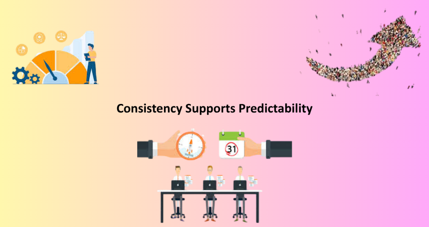
Principle 2: Consistency Supports Predictability
Uniform Navigation and Page Structure
Predictability is one of the aspects of usability that is important: when a user interacts with the website, he has to understand what to expect. His mental model hence forms with the help of consistent navigation menus, page layouts, iconography, and terminology in the website, even for people with cognitive disabilities, who may have problems learning a new navigation system each time they come to a new page. Repeating a familiar pattern helps ensure that when users learn something on one page, they can use it on another without confusion.
With the same heading and landmarks, consistent page structure is also an advantage for screen reader users since they can easily jump to their desired sections. If the same menu position, search bar, and footer contents exist on the page, the user will spend less time getting acquainted and more time doing what he or she is supposed to do. Accessibility is bringing an element into reach; reliability also extends to the simple premise being able to fit freely into it when required. The same structure builds usability and accessibility by allowing interfaces to be more intuitive while reducing the level of cognitive effort required for navigation.
Design Systems and Component Reuse
That is how much system design interfaces within usability and accessibility will have the same interface components. Therefore, buttons, form inputs, alerts, and modals should all behave identically whether they occur. This consistency eliminates the need to pry into new interaction models in many places on the site and helps instill confidence in using it. For the motor impaired, their problem in clicking wrong items from a given arrangement is minimized because size placements of such identical components will not create surprises from page-to-page layouts.
By reusing components, it is easier to test accessibility; there is no need to have an accessible component to create further problems anywhere else on the site. It is faster and more effective for teams involved in inclusive design, enabling quicker iterations while keeping the overall standard of accessibility standards high. The consistent interaction allows users to develop habits while using the website more efficiently and independently since it does not always undergo change.
Principle 3: Feedback Reinforces Action
Immediate and Understandable System Responses
I am wholly intent on providing feedback that will keep users aware and within usability continuity and, in accessibility, of utmost importance. Whether a user has clicked a button, sent a form, or made a selection, he or she requires distinct feedback on whether the action is received or understood. This is particularly important for people with cognitive disabilities who may not know whether their action was effective, as well as for users with visual disabilities who rely primarily on hearing or screen reader feedback to discern interfaces.
Loading spinners, success messages, and error messages demonstrate that something is happening in the background. These indicators must be accessible, though. This means that a form validation error has to be both visible (for example, red text) and programmatically triggered so that a screen reader would announce it. Accurate representations of real-time updates might reach all ends of the spectrum by ARIA live regions and alert roles. By timely clear feedback, the websites build user satisfaction while minimizing frustrations.
Error Prevention and Recovery Assistance
Usability, as far as I am concerned, is feedback, although most of all, it is about preventing errors in the first place. Data entry in form input, proceeding to a checkout, or a search can be major areas of friction for users with disabilities. Auto-complete, field validation, and an accessible explanation can help avoid errors in the first instance. Clear indication of whether fields are required or optional, in addition to a standardization of formats for dates or numbers, should thus be applicable to all users.
Yet when errors occur, the site should assist users in recovery. Use simple words about what went wrong on the error message, and how to remedy it. In addition to visual indications, a text or screen reader-friendly explanation should also help in recovery. Highlight the field that caused the problem, give examples of valid input, and keep the values already entered. These all contribute to improving user experience. Accessibility doesn’t prevent errors; it gives the users a way to rectify their actions without undue frustration or failure.
Principle 4: Flexibility Accommodates Diverse Needs
Multiple Interaction Methods
Demonstrating accessibility usually means giving people quite a few ways to engage with content and undertake tasks. Some might choose to operate using a mouse while others may prefer a keyboard or use voice command or even a screen reader. In fact, designing an interface flexibly to allow diverse input methods results in reaching more people. All interactive elements must be operable by keyboard alone, thus making the elements more widely usable even for the users with motor disabilities who cannot use a mouse. So if you provide focus indications, those users will be able to keep track of where they are at all times on the page.
That, however, is only the beginning. It can communicate in other languages as well. The hearing-impaired should be able to see the video with subtitles and a transcript. Visual impairment can be limited by infographics and charts with text view descriptions or data tables. With multimodal interactions, the door is opened for access through various perceptions and interactions with the page. That adds to inclusivity and, at the same time, prepares the website for fulfilling various user needs in various contexts – mobile use or noisy environments – and on into the future.
Responsive Design and Personalization Options
Responsive websites work great so to make easiest for anyone but especially for users who depend different settings for reading or mobility- moreover these areas become more friendly with the inclusion of adaptive dimension. A responsive design thus requires users from not at all scrolling laterally and having to zoom excessively, especially with an individual whose fingers are not that dexterous; this would spoil the entertainment anyway because of layout flexibility in content stacking as well as image resizing- all these contribute towards having a better experience from one screen type to another.
Personalization options also greatly increase both usability and access. Customization for users considering changing the text size, adjusting contrast levels, or changing to the dark mode may highly affect readability and coziness; this is very important for those who have low vision or light sensitivity. Not every feature needs to be present in every website but respecting user preferences such as browser settings or integrating accessibility overlays is part of an inclusive design. Flexibility in the presentation acknowledges the differences among users and empowers them to mold their experience according to their needs.
Principle 5: Accessibility Is Usability for All
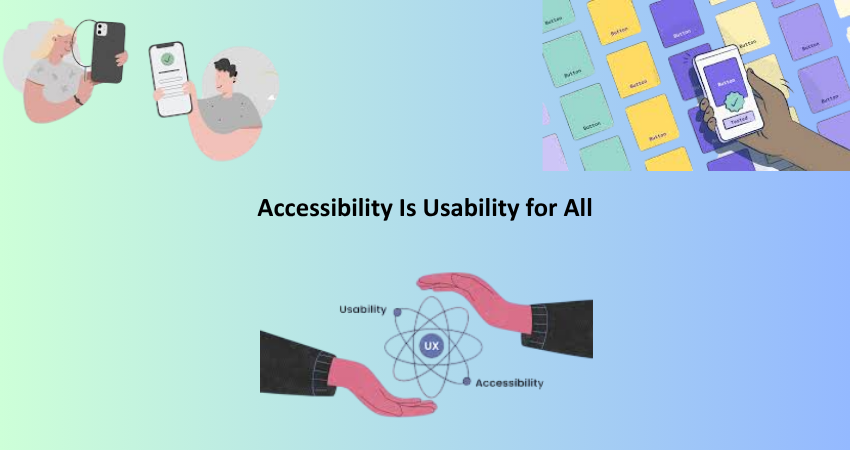
Inclusive Design Benefits Everyone
At usability’s heart sits designing for the widest potential audience. Accessibility is not incidental or merely a legal concern; it should be integrated from the ground up into any design process. When usability principles are put into practice with an inclusive lens, the experience is improved for all users. For example, captions help deaf users, but they also help users in an environment where noise levels are intrusive. Keyboard navigation assists both power users and those with physical impairments.
When designers and developers consider accessibility when focusing on usability, they are guaranteed to have better products. Websites become easier to navigate, faster to use, and more fun to work with. This leads to lowering the bounce rates and higher conversion rates, which strengthens the brand’s loyalty. Inclusive usability isn’t compromise; it’s enhancement. It leads to digital experiences that are flexible, empathetic, and resilient. This position not only ensures that corporate bodies adhere to the law, but it also sets a new benchmark for others to follow.
Designing with Empathy and Real-World Testing
Empathy is what makes usability inclusive. It must be focused beyond personas or analytics; it must show how that user would encounter life with temporary disabilities, situational impairment (such as using a phone out in bright sunlight), and permanent conditions. Involving users of varying capabilities in the design-and-testing process is part of designing with empathy. It considers the fact that there is no single experience when speaking of the “average” user.
Usability testing with people with disabilities provides insights that conventional types of testing would miss out on. Observing real users and their navigation of your site—confusions, time delays, excitement—should form the basis of informed decisions to improve access. Use tools such as screen readers, magnifiers, and color blindness simulators in testing but go even further and take in human feedback from a wide range of perspectives to validate your designs. An empathetic approach to design means that your site is usable but also welcoming to all people.
Conclusion
Usability and accessibility are intertwined concepts, principles that may ensure easier and more intuitive access to a website by the general population, also work to ensure access by users with disabilities. Emphasis on these principles is the most important foundation for clear, consistent, and feedback-needy, flexible, and empathic design. Usability principles would lead designers and developers into digital environments whose efficacy is far beyond a definitive technical compliance to real-world accessibility.
Thus, it becomes possible from the page of true access beyond checklists for inclusiveness in the great march towards true inclusion. Not just applicable to permanently disabled users but each person needing to access your site under less-than-ideal conditions. Today, those who are not digital are in a world wherein inclusivity becomes more crucial than ever; thus, aligning usability with accessibility promises to take the best practice route: it’s always a moral thing to do, and it can be a winning edge upon competition. Such tenets shall guide your work to create empowering, respectable web experiences, and usability without borders.