Introduction
After all, by 2025, digital inclusivity has become the in-vogue duty. With sophistication taking over the apps and websites, checking visual accessibility becomes a serious step toward an overall inclusive experience. Visual accessibility is a design notion aimed at providing an easier interaction between users that are visual impaired (like color blindness, low vision, or total blindness) with digital content. These areas are well understood by most designers, yet it is unbelievable how many vital accessibility considerations are overlooked during the development process.
As standards evolve with the introduction of WCAG 2.2 and new tools to test accessibility in an instant, it has never been easier-or so crucial-to develop digital environments that work for everyone. Even the most well-meaning design teams tend to fall into traps that hinder accessibility and undermine the user experience. These errors do not just alienate people but also expose them to risks legally, ethically, and from a branding perspective. It is, therefore, relevant that any consideration going towards web design, app design, or design of other digital products should avoid these top 10 visual accessibility blunders in 2025 for compliance, competitiveness, and compassion.
1. Using Low Color Contrast Ratios
Why Low Contrast Fails Users with Visual Impairments
A common sight among visual accessibility problems on websites is low color contrast between foreground text and background elements. Some designers might find this appealing, but it spells big trouble for users with visual impairments such as low vision or color blindness. The Web Content Accessibility Guidelines (WCAG) require at least a 4.5:1 contrast ratio for normal text and 3:1 for large text, yet this is not being satisfactorily followed by a lot of sites. Distinguishing poorly around the color track can make users unread crucial information; navigate across pages or some simple tasks like filling up forms and clicking buttons. Therefore, it frustrates them into losing conversion and engagement.
Creating design with accessibility in mind doesn’t and should not mean give in to aesthetics. Most times, it actually results in neater and more readable interfaces that would benefit not only those with disabilities but everyone. Identify and fix contrast problems early in the design process using tools like the Color Contrast Analyzer, axe DevTools, or Stark for Figma. Consider adding patterns, underlines, or bold words to differentiate these interactive objects even more from their context. Therefore, avoiding low-contrast color schemes and providing strong background contrast would suffice from a legal and ethical standpoint to make it a design that is all the more inclusive and effective.
2. Relying Solely on Color to Convey Information
The Pitfalls of Color-Only Indicators
Relying on color alone for communicating meaning is a classic accessibility mistake that many designs still suffer from in 2025. Picture a form that uses red highlights to indicate errors but gives no other labels, icons, or messages. This visual cue would be invisible to any user who is color-blind, especially those with red-green color blindness, leaving them confused and uncertain about what to do next. Indicators that are reliant solely on color act as a huge barrier to many users in comprehension and usability. This issue is a common one in graphs, buttons, alerts, and input validation, often ruining the usability of otherwise well-designed interfaces.
The need for clarity mandates the use of measures other than color in the encoding of meaning. For instance, an error field should be outlined in red, with an icon and descriptive text such as “This field is required.” Likewise, patterned or uniquely shaped data points may be used with such data visualizations to ensure charts are legible for all. This guarantees that users can retrieve the information they need in a format they can interpret, regardless of how they perceive color. Inclusive design is not merely about looks; it’s about utility and clarity for all users.
3. Inadequate Text Sizing and Font Choices
Why Readability Depends on Proper Typography
Fonts and text sizes play a crucial role in visual accessibility. Modern small or thin typography used by many websites or apps may look trendy, but it is often the reason for denied reading accessibility of users with low vision, dyslexia, or cognitive conditions. While small text compels users to zoom in or squint their eyes, this adds to unnecessary cognitive and physical stress. The WCAG recommends setting body text at a base font size of at least 16px and ensuring line heights and spacing to facilitate the easy scanning and comprehension of text. Not using web-safe custom typefaces may also bring about compatibility problems or inconsistencies across devices.
Opting for fonts is not in favour of showing better aesthetic quality but gives more preferences towards legibility. Such fonts include those like Arial, Helvetica, and Verdana, otherwise called sans-serif fonts, which tend to be easier to read than fancier or script fonts on computer screens. More to say, a line space of 1.5x size of the font or greater along with letter spacing should reduce eye fatigue and aid in comprehension. Accessibility also included users who need screen magnifiers or zooms functionality; therefore, scaling must be done without breaking or overflowing with designs. Responsive typography, flexible layouts, and wise font selection will leave no one uncomfortable reading your content, despite one’s ability or revolving capacity through its device.
4. Overlooking Keyboard Navigation and Focus Indicators
Why Mouse-Free Interaction Matters
Many users, such as those with motor disabilities or visual impairments, rely on keyboards for website navigation rather than mice. Unfortunately, the poor implementation of keyboard navigation is quite widespread. An illogical tab order, missing tabindex attributes, and invisible focus indicators can render an interface virtually unusable to these users. Your site may be technically navigable, but without a clear focus state, users are forced to guess their location on the page—leading to frustration, abandonment of the process, and failure in accessibility.
All interactive items—links, buttons, inputs, menus—must be accessible and operable by keyboard alone to give a truly accessible experience. All those must also define visible focus styles that clearly indicate the currently selected component. Also, avoid removing browser-default focus outlines without replacing them with a custom style equally visible. The logical order of focus should also follow the visual layout to maintain usability. Assistive technologies, in many instances, would leverage the structure to guide a user through the content. Effective keyboard operation is good design for all users by enhancing usability for power users-heavily dependent, disabled, and screen reader users alike.
5. Failing to Provide Text Alternatives for Images
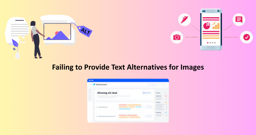
The Importance of Alt Text for Screen Readers
Alt text, or alternative text, offers an important means of communicating visual content to visually impaired users reliant on screen readers. However, in 2025 there are still many instances of websites lacking, misusing, or applying vague alt attributes. By omitting alt text on logos, infographics, or even images meant to elicit calls for action, a barrier to web accessibility is being erected. Whereas screen readers utilize meaningful alt texts to vocalize images for the benefit of blind users as they interpret content and find their way in digital environments, in the absence of meaningful alt descriptions, visual context and critical information are denied to them.
The key focus for an alternative text are clarity and relevance. The descriptive text should tell what the image does or provide information about it without unnecessary elaboration. Images are non-informational decorations that should keep an empty attribute: alt=””. This means that these images would be skipped over by screen reader users and would keep viewers focused on the important content. Functional images, such as buttons and icons, must describe their functions in the alt text; for example, by “Submit form” or “Go to homepage”. Good alt text creates an aspect not only in addition to making content accessible; rather, it can be beneficial to SEO and user experience as well.
6. Ignoring Responsive Design for Accessibility
How Device Flexibility Impacts Inclusive Access
It is not only a matter of aesthetics and device compatibility but a major factor of accessibility itself. Users with disabilities may need to rely upon other devices or adaptive technologies to gain access to content. For example, when a design looks perfect on the desktop and falls at mobile, accessibility can be severely hindered. Some common problems include overlapping text, non-scalable elements, or fixed layouts that do not adjust to either screen size or user settings. The problems worsen in the presence of assistive technology such as screen readers or magnifiers.
To counter those barriers, designs should contain fluid grids, flexible images, and scalable typography. Test layouts across the screen sizes and orientations, and ensure touch-friendly interactive components have enough spacing. Use accessibility testing tools, like Lighthouse, VoiceOver, and TalkBack, to put the systems through their paces for detecting problems early on. In addition to use by all users on all devices, accessibility gets built into your responsive framework in that it would ensure that it works well regardless of whether the users have any challenges.
7. Not Designing for Screen Reader Compatibility
Making Your Code Understandable to Assistive Technology
Even though visual design is critical and plays an important role for accessibility, especially on the part of screen readers, the real impact is behind what is code structured. Many developers completely miss the point of using good old-fashioned semantic HTML, ARIA (Accessible Rich Internet Applications) attributes, and correct heading hierarchy-all of which make a function even harder for screen-reading to comprehend content in a currently logical-to-very-held-to-understand way-disruption even follows in the cases of those custom Java Script components really bad:” ! Breaking the conformity with UIAC41803 for desktop uses.
For example, appropriate tels such as <header>, <nav>, <main>, and <footer>, create a meaningful structure for the whole document. Appropriate heading levels also <h1 through to h6> help screen readers provide the context and give a site user the option of skipping through sections at will. ARIA roles and labels should complement and not be a substitute for using appropriate semantic tags-long use of ARIA creates confusion or contradictory information. Well-structured semantic code that is tested using genuine screen readers makes a pretty interface accessible to assistive technology.
8. Inconsistent Labeling of Interactive Elements
Why Consistency Drives Clarity and Usability
Often times inaccessible design comes from inconsistent or poorly defined labels on forms, buttons, and controls. Ambiguous labels such as “Click here” or labels with unclear meaning may result in users with visual impairment not being able to identify what a button does. Input fields without valid labels create confusion for screen reader users, who depend on such explicit cues to fill forms and navigate controls.
Consistency in labeling is the foundation for every user in your interface, including those using assistive technology. Each button, link, or form element should have a truly descriptive and unique label. Label tags for inputs must be associated through the for and id attributes. Never rely on placeholder text; it disappears once a user begins typing, and clear labels serve to facilitate accessibility and usability. This, in turn, minimizes friction and maximizes ensure successful task completion. Labeling is one of the basic principles of inclusive design, allowing all users to feel confident and able when interacting with your content.
9. Using Complex Animations or Auto-Playing Media
The Hidden Barriers in Motion and Sound
Auto-playing videos, flashing animations, or non-skippable intros are all very engaging, yet, accessibility-wise, they create serious hurdles. From cognitive disorders to vestibular sensitivities and almost all attention-related disabilities, most existent users find them disorienting and disturbing. Fast motion has been noted to trigger migraines or seizures in some users while unsolicited sounds interfere with screen reader navigation. These do not just reduce accessibility but are detrimental to the user experience.
To provide an accessible experience, always default to the absence of auto-play, and equip all media items with clear, user-controlled play/pause buttons. Below the WCAG by offering reduced mode preferences via CSS (prefers-reduced-motion). Make animations straightforward and functional, and have none that flashes more than three times a second. Bringing about respectful motion and user consent into multimedia design guarantees that your contents are inclusive, secure, and enjoyable by all audiences.
10. Skipping Accessibility Testing and Audits
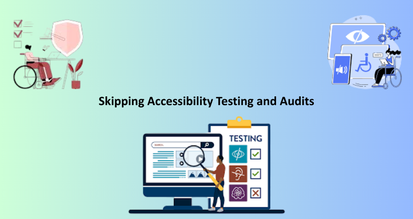
Why Ongoing Evaluation is Essential
The last—and maybe the most damaging—visibility access fault is to ignore the product with actual users and tools. Most designers assume that if the site looks good and works on their machine, it is accessible. But visual accessibility requires continuous testing with different devices, user scenarios, and assistive technologies. Without proper assessment, one cannot tell how far along the design is in being inclusive.
Accessibility audits using tools such as axe, WAVE, or Lighthouse, or manual screen reader testing help you find issues that you may miss otherwise. It is equally beneficial to involve users with disabilities in usability testing to provide them with firsthand insights into their experience. Accessibility is a commitment, not a checkbox. Establishing testing as a regular activity in your design and development processes leads to the creation of digital experiences that are strong, usable, and in line with the changing standards. It is exactly the sort of difference that truly defines the site one seeks: exclusion or hospitality.
Conclusion
The visual accessibility should not only be there to meet the compliance issue but should also help build experiences that respect all users, include them, and empower them as well. And by the time the world crosses over to 2025, designers and developers will have to make accessibility part of their central responsibilities and not really a peripheral consideration. As noted in this article: ‘mistakes from poor contrast to no testing’; these are not just technical follies; they are also opportunities missed for creating digitally present humane products. By taking the proactive measure of addressing these visual-accessibility potholes, it would thus be possible to create an inclusive web-one through which everybody can navigate and thus understand and, more importantly, interact with it no matter what ability their endowment is.
Visual accessibility also benefits the reputational build of your brand and more importantly improves the search engine optimization footprint while broadening the exposure of your product to a bigger audience. Included among the companies that i would call out would be those that practice inclusive design; thus, they can be easily distinguished from the rest in today’s competitive landscape digitally, with a high probability of winning trust and loyalty among users. Ultimately, accessible design is not just a social responsibility; it is a smart business decision. Make your digital content work for everyone, and you will have built products that are resilient, user-centric, future-proof, and so on.