To say that a landing page constitutes another web page would be an understatement. Instead, it is an instrumental web artifact with a single aim: conversion. Landings funnel to capture leads, sell a product, or promote a webinar, with their clarity of messaging and persuasion right down to a call to action. So how does one construct an actual converting landing page?
Let’s break these down into key components. Each section below will unravel essential steps, right from layout to copy, and then testing and optimization—because effective landing pages are not coincidental; they are built on purpose.
Define a Clear Goal for Your Landing Page
Even before the first rough sketches of the layout are drawn or a font chosen, ask yourself: what do I want this landing page to accomplish? The next choice—from content to design to call-to-action—must invariably conform to this one goal.”
Focus on One Conversion Objective
It’s best not to offer too much on a single page, since your visitors might lose interest. Avoid cramming different CTAs or offers into one page; instead, be single-minded on one, whether getting subscribers to a newsletter, selling a product, or allowing someone to ask for a consultation.
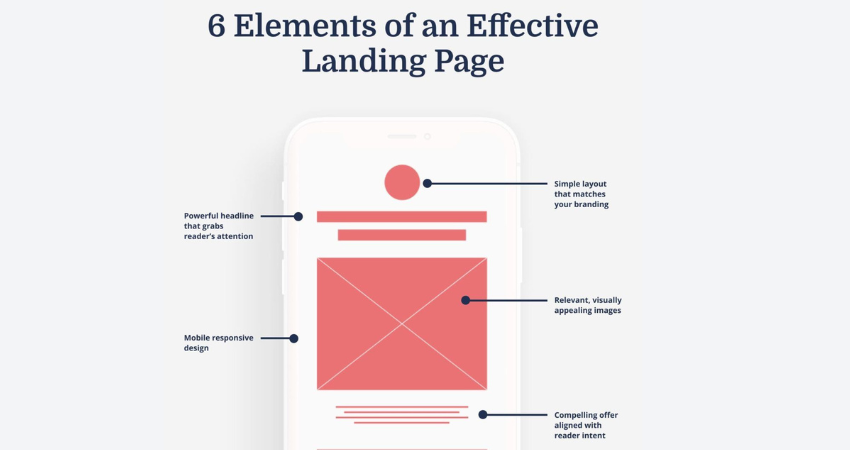
When a user lands on your website, they should immediately know what you’re about and what action they are supposed to take. Clear, specific headlines and a very visible CTA (“Get My Free Guide” or “Start My Trial”) help reduce all that decision fatigue. Keep the message tight without distraction. One page, one goal. That’s the basic rule of conversion.
Design With Simplicity and Visual Hierarchy
Great landing page design isn’t about look; it’s about guiding the attention of users where it should be, when it should be. A clean, uncluttered layout with strong visual hierarchy leads visitors to your CTA. Great landing page design is about the right direction, not about flashy aesthetics.
Use Whitespace and Contrast to Highlight Key Elements
Whitespace makes content breathe and the things on a landing page easier to scan. Don’t crowd everything together. Instead, give everything room to breathe and stand out.
Use contrast-a bright color against a muted tone, big text versus small-to draw attention to your most important sections, especially your call-to-action button. For instance, a red or bright orange button against/off-white background is like a flare.
Use directional cues too. Include images of arrows or lines that lead the eye toward your CTA or images of people looking toward the CTA. Those subtle cues help guide the user’s eyes toward the call-to-action without being overbearing.
Craft Compelling Headlines and Subheadings
A huge percentage of visitors tend to judge your site purely on the headline. The first impression is critical, and it usually decides whether to go on with the rest of the web page or to leave it all behind. An effective headline must communicate clearly, promise something interesting, and engage the reader’s emotions.
Speak Directly to the User’s Pain Point or Desire
People do not make noise for your product but only for what the product does for them. This is what the headline should concern: the outcome or solution they get from taking action.
Instead of saying, “Top SEO Services,” say, “Get More Leads With SEO That Works.” This way, it tells the visitor exactly what is in it for them.
The subheadings will now support the main headline by providing further detail or curiosity. They should, however, keep it short, punchy, and persuasive. Together, they should form a narrative that moves the user to the action down the page.
Optimize Your Call-to-Action (CTA)
Your CTA is the that of your landing page. By creating a button, link, or form, you get users into converting. It has to be pronounced well visually, emotionally, and functionally.
Make CTAs Action-Oriented and Benefit-Driven
Stay away from generic button words like Submit or Click Here. Instead, ensure that your CTAs are more personal and more benefit-oriented, such as Download My Free eBook or Start Saving Today.
Place your CTAs in multiple areas of your landing page, such as the top, the middle, and the bottom, especially on long-form landing pages. However, be consistent with your messaging.
Also, remove friction. Do only ask for information you absolutely need. The more fields you ask of users, the more opportunity they will have to back out. Split forms if it is possible or incorporate autofill options for the best experience.
Build Trust With Social Proof and Testimonials
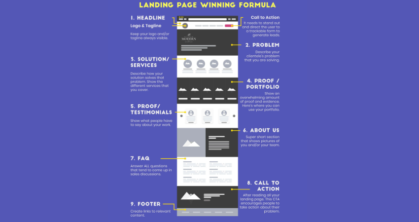
Unfortunately, nobody prefers being the trailblazer. A fair portion of people take action when they observe some immediate gratification from others’ experiences. So, testimonials, reviews, and trust badges play a pivotal role here.
Showcase Real People and Real Results
Incorporate glowing recommendations from pleased clients, trustworthy logos from the customer base, or figures to lend more credence to your words. Better still-indite a video testimonial; make your brand personal with a touch of genuine emotion.
All sorts of possible security seals, whether they be “Safe Purchase” seals, payment logos like Visa or PayPal, or certification logos, can be helpful in giving users that extra feeling of safety.
Place them adjacent to your CTA or form so that such reassurance is present in their moment of decision. Authenticity is key: no stock pictures or vague quotes will do. Just let your happy customers do the talking.
Test and Optimize Continuously
A high-converting landing page is never finished. Even small changes can make a big difference. A/B testing and analytics help you understand what’s working—and what’s not.
Use Data to Drive Design Decisions
Inspect various options in headlines, CTA text, colors, or even layout orders. Google Optimize and Unbounce are fantastic tools to create experiments.
Look into heat maps and scroll maps to analyze the users’ moments of boredom. Should people not be scrolling past the fold, consider moving the CTA higher or adjusting your message.
Optimization is an endless game; set conversion goals in Google Analytics, track user behavior, and keep iterating based on what the real data says.
Conclusion
It is not about getting flashy, persuasive buzzwords in designing and developing landing pages that convert. It instead entails gaining clarity and understanding while giving intentional structure. From crafting powerful headlines to placing strategic CTAs, all the features must work toward leading the goal of talking the user toward your goal.
Simplicity wins; make it easy to understand users see how they can take action. Have a single purpose on every page, keep distractions to a minimum, and back your claims with real proof. Combining the best practices of design with rules of human psychology leads to building the landing pages that don’t only look good but also perform well.